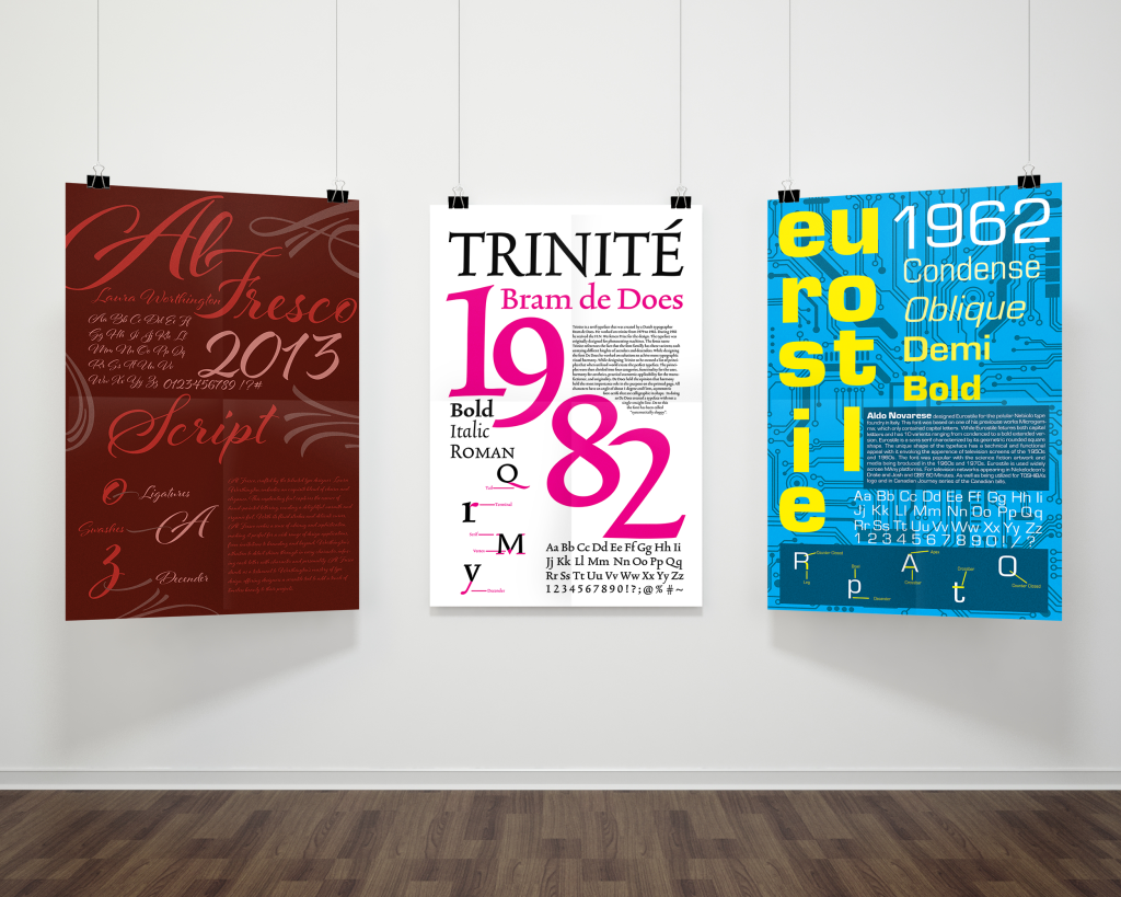
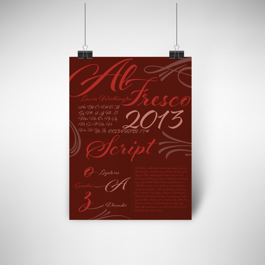
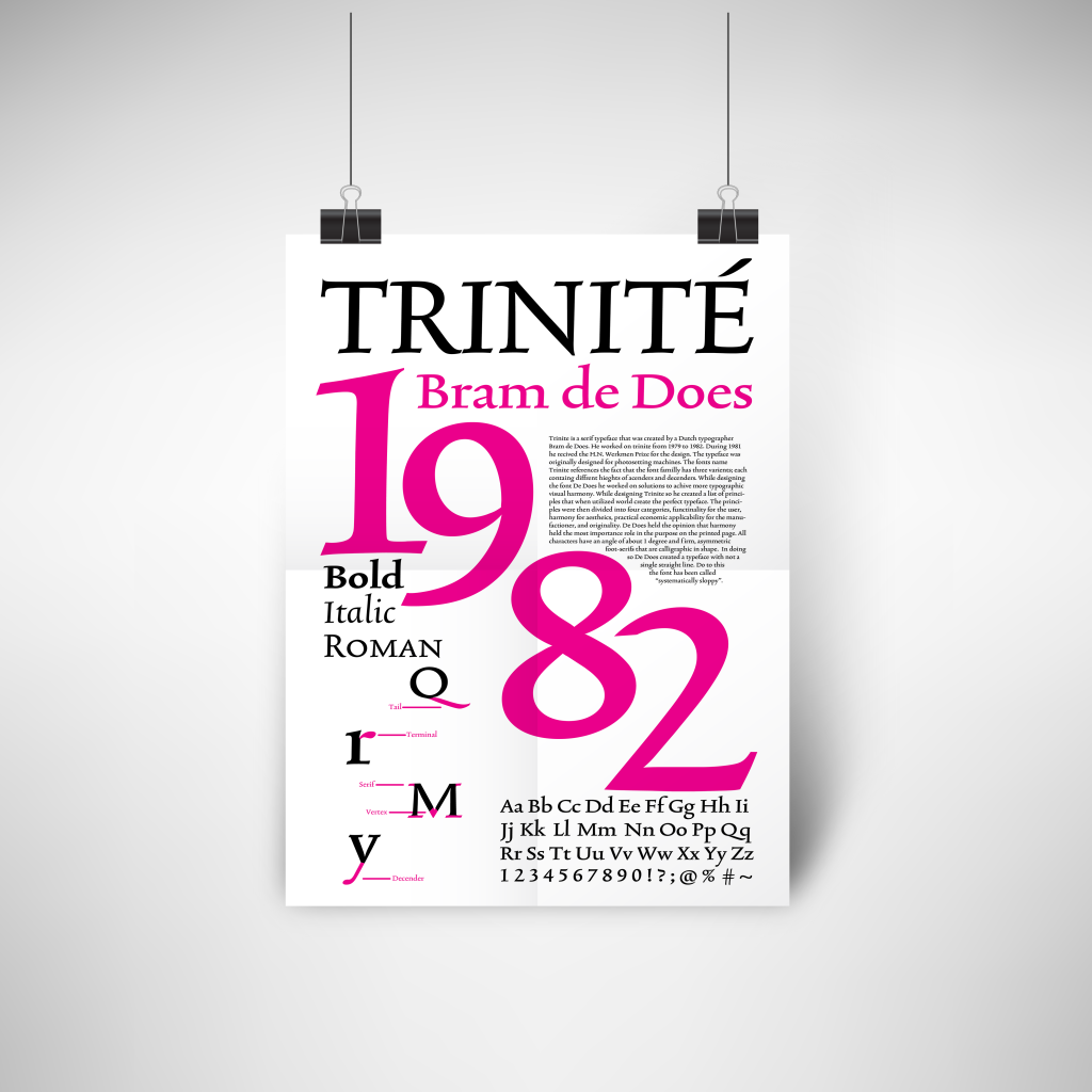
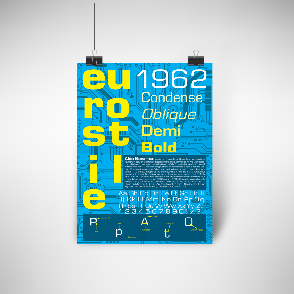
Typography is a fundamental aspect of graphic design, and creating posters that illustrate fonts offers valuable insights into its nuances. In this project, I crafted three posters, each dedicated to a different type classification—serif, san-serif, and script fonts—aiming to highlight their differences and typographic definitions.
Crafting Typeface Posters
From Sketches to Screens
The project commenced with a comprehensive exploration of each font, starting with the layout of the entire alphabet to understand its visual characteristics. Subsequently, I generated six thumbnails for each font and translated them into rough sketches. Moving to Illustrator, I meticulously laid out the posters, navigating through the iterative process of trial and error to refine the final design.
Embracing Bold Color Schemes
Experimenting with Color Palettes
Challenged to step out of my design comfort zone, I embraced bold color schemes to complement the selected fonts effectively. Considering options like a black and white poster with a pop of magenta, a vibrant blue and yellow color scheme, and a palette featuring striking red tones, I sought to harmonize color choices with font selections, pushing the boundaries of my creative exploration.
A Fusion of Typography and Color
Communicating Font Characteristics
Through the creation of three distinct posters, I delved into the intricacies of typography and explored various typefaces, enriching my understanding of font classification. Embracing bold color schemes and departing from my usual muted palette, I crafted visually striking posters that effectively communicated the unique characteristics of serif, sans-serif, and script fonts. This project served as a platform to challenge myself creatively and refine my skills in harmonizing typography with vibrant color choices.