Venturing into uncharted territory, I embraced the challenge of crafting a logo for Arsenio Craft Brews, a foray into an industry unfamiliar to me. Beginning with the font name Arsenio as my starting point, I embarked on a journey of exploration and creativity, seeking to encapsulate the essence of this brand within a timeless emblem.
Sketching Ideas and Finding Inspiration
The Evolution of the Arsenio Logo Design
Immersed in the world of logo design, I immersed myself in the process of sketching thumbnail concepts, drawing inspiration from vintage badge-style logos to infuse a sense of authenticity and heritage into the Arsenio brand identity. Each sketch was a step closer to defining the visual language that would represent Arsenio Craft Brews, with elements like abstract barley motifs and brand name banners emerging as integral components of the design.
Precision and Refinement
Elevating the Arsenio Logo to Its Full Potential
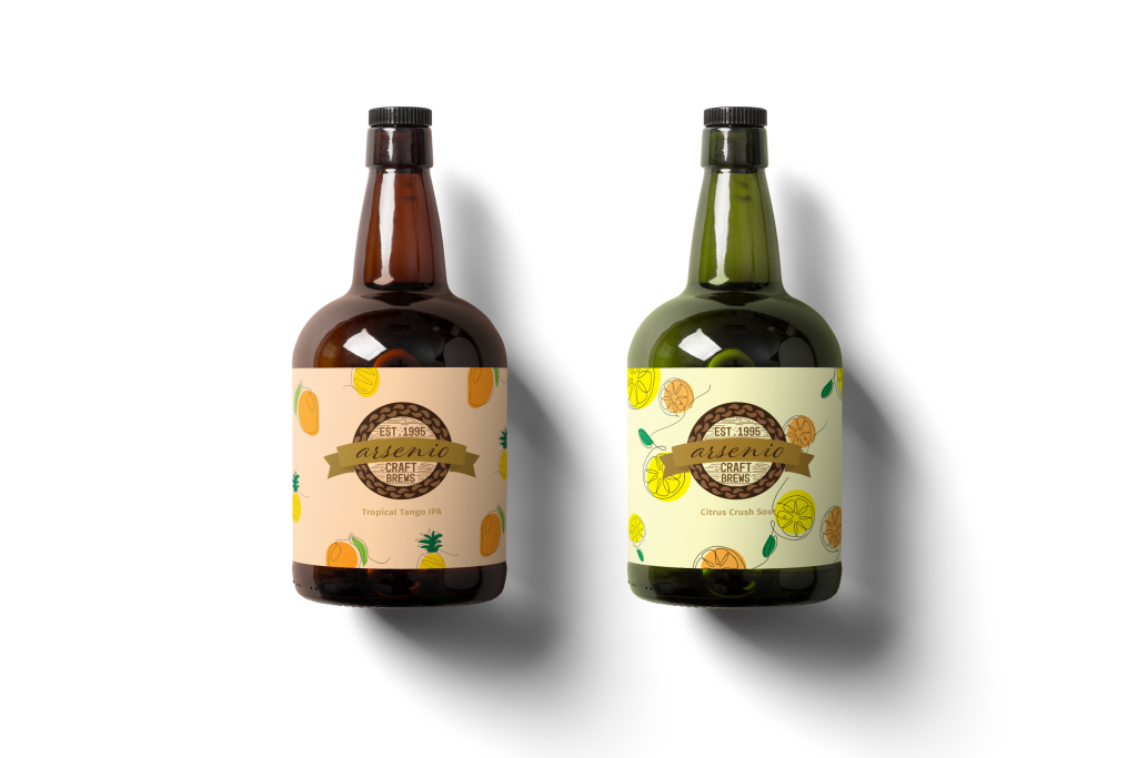
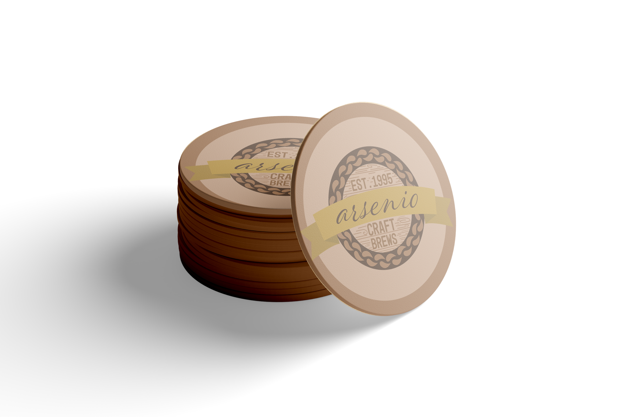
As the design journey progressed, precision became paramount in refining the logo’s details. I envisioned a logo that seamlessly blended tradition with modernity, opting for a wood base background to evoke a sense of craftsmanship and authenticity. Careful consideration was given to typography, with the choice of uppercase sans-serif and lowercase script fonts reflecting the brand’s blend of classic and contemporary elements. Deliberate color selection further enhanced the logo’s impact, with shades of brown evoking warmth and richness, while a touch of gold added a sense of luxury and sophistication.
Distinctive Identity, Timeless Appeal
The Final Outcome of the Arsenio Craft Brews Logo
The culmination of this design endeavor is a logo that not only captures the essence of Arsenio Craft Brews but also speaks to its heritage and craftsmanship. With its vintage charm and contemporary appeal, the logo serves as a visual representation of the brand’s commitment to quality and tradition, inviting consumers to embark on a journey of discovery and indulgence with each sip.